Research
Overview
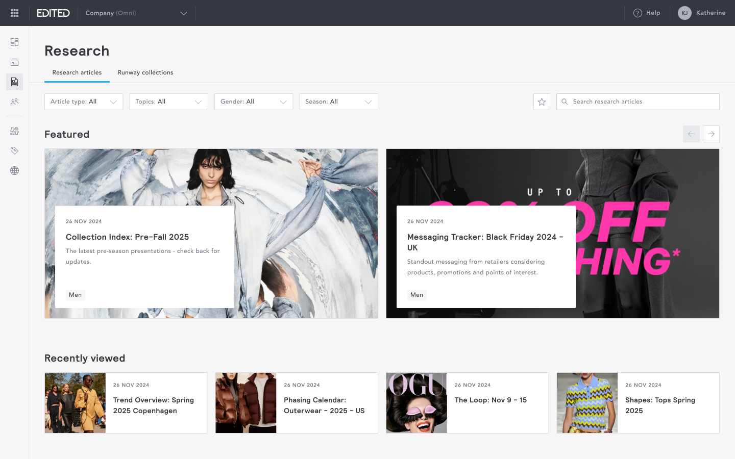
Research provides data-backed retail analysis, trend insights, and runway coverage created by EDITED’s in-house industry analysts using live data from the platform.
Research was the second most-used feature on the legacy platform. Re-platforming it presented a clear opportunity to accelerate myEDITED adoption while delivering immediate, tangible value to users.
I led the re-platforming of Research to myEDITED. It became a core engagement driver for the platform, contributing to a 119% increase in time spent in app and a 44% increase in platform stickiness.
Goal
To re-platform EDITED Research into myEDITED, using the new design system to deliver a cleaner, more visual, and intuitive experience while maintaining familiarity for existing users.
Success criteria set with the PM at project start:
- Successful migration from the legacy platform to myEDITED.
- At least a 20% increase in myEDITED adoption and usage post-launch.
Approach
I worked directly with EDITED's in-house Retail Analysts to ensure the migration aligned with both editorial and analytical workflows. Together, we identified pain points in the legacy experience, redefined the information architecture to improve navigation and discoverability, and mapped out where meaningful improvements could be made.
Unlike the rest of the platform, which is built around tables, charts and filter configurations, I wanted Research to feel distinctly different; high visuals and immediately engaging.
Navigation
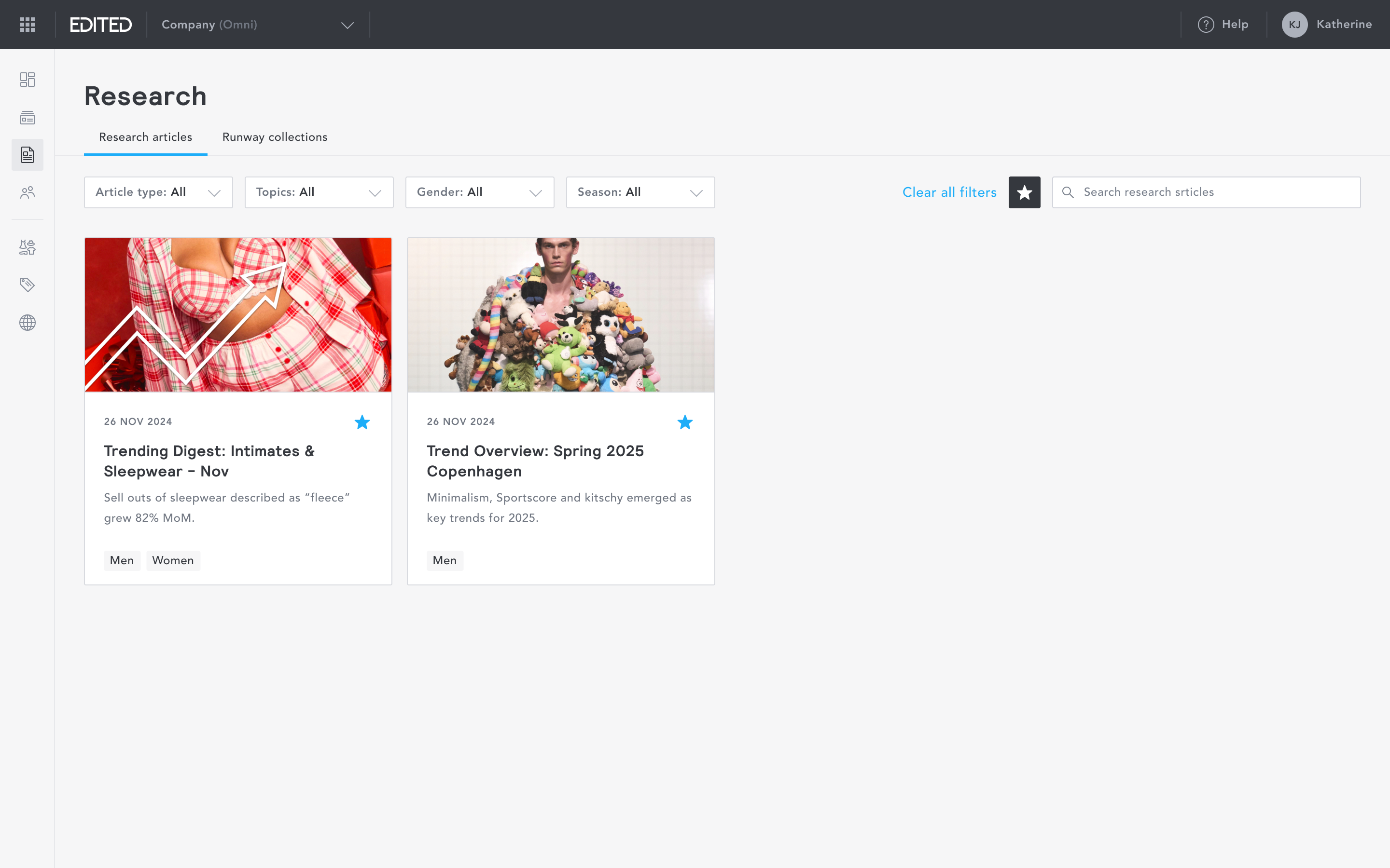
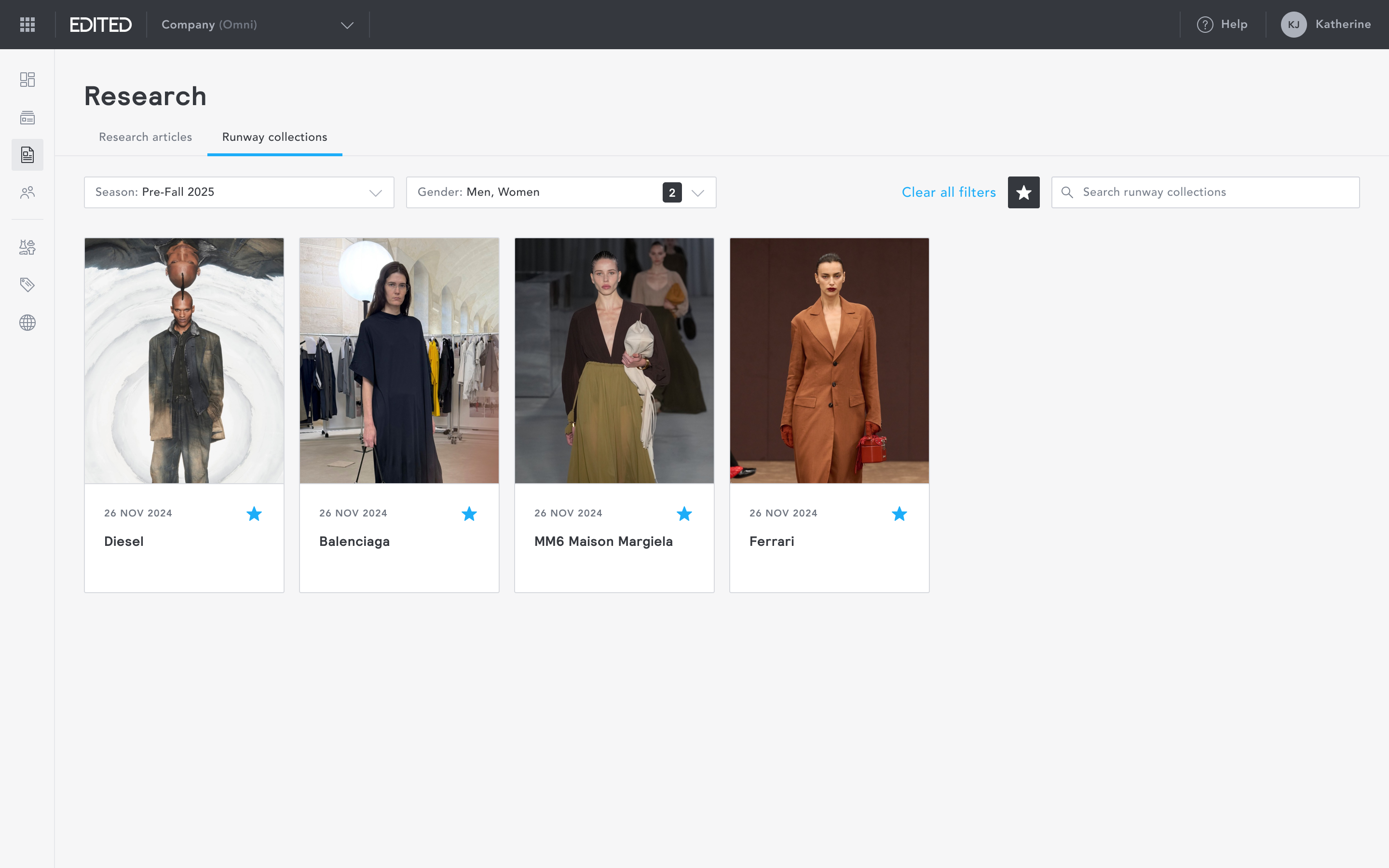
EDITED Research consisted of two main content types:
- research articles: data-backed reports combining market analysis and trend insights, and
- runway collections: a curated gallery of images from global runway shows
In the legacy platform, switching between these content types was hidden behind a dropdown menu, meaning first-time users had to hunt before finding it. I surfaced both content types as two clearly separated tabs from the outset, giving users an immediate understanding of what was available without needing to explore.
Research articles: Layout
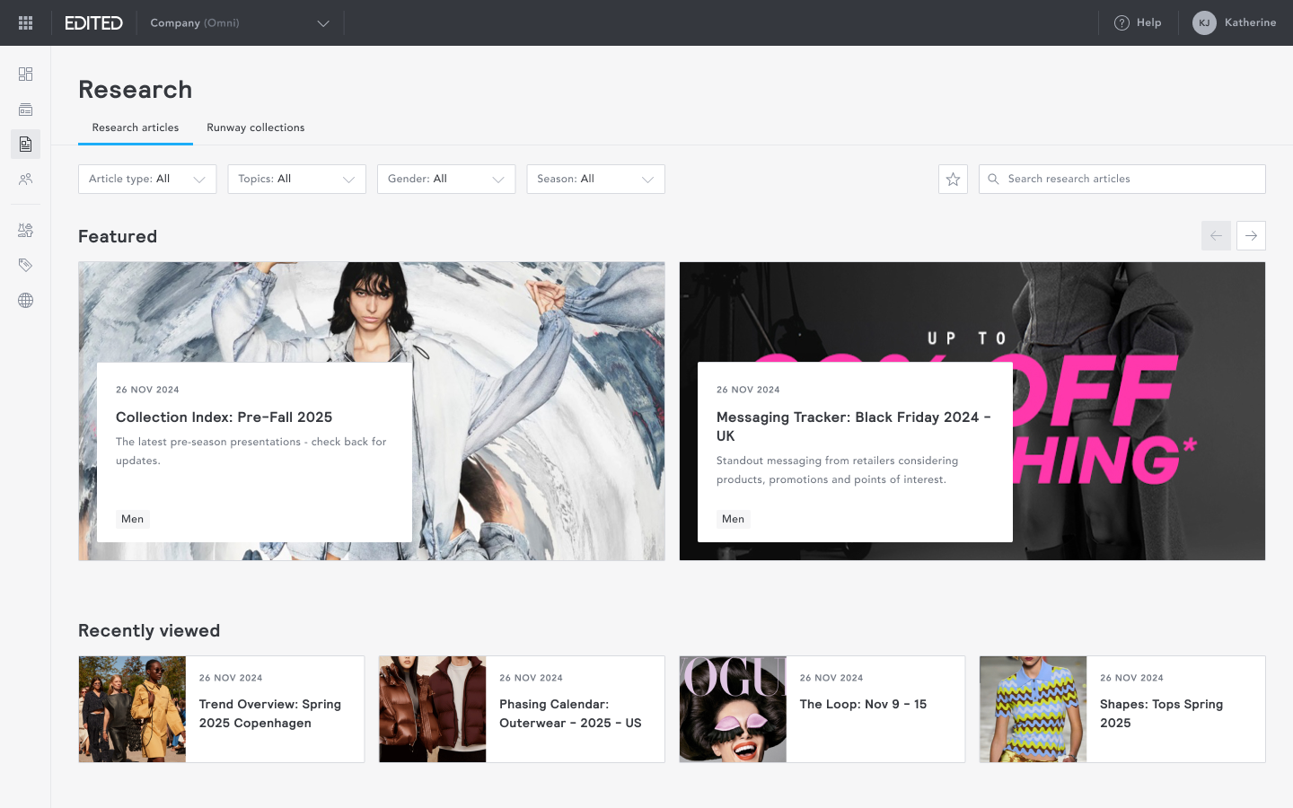
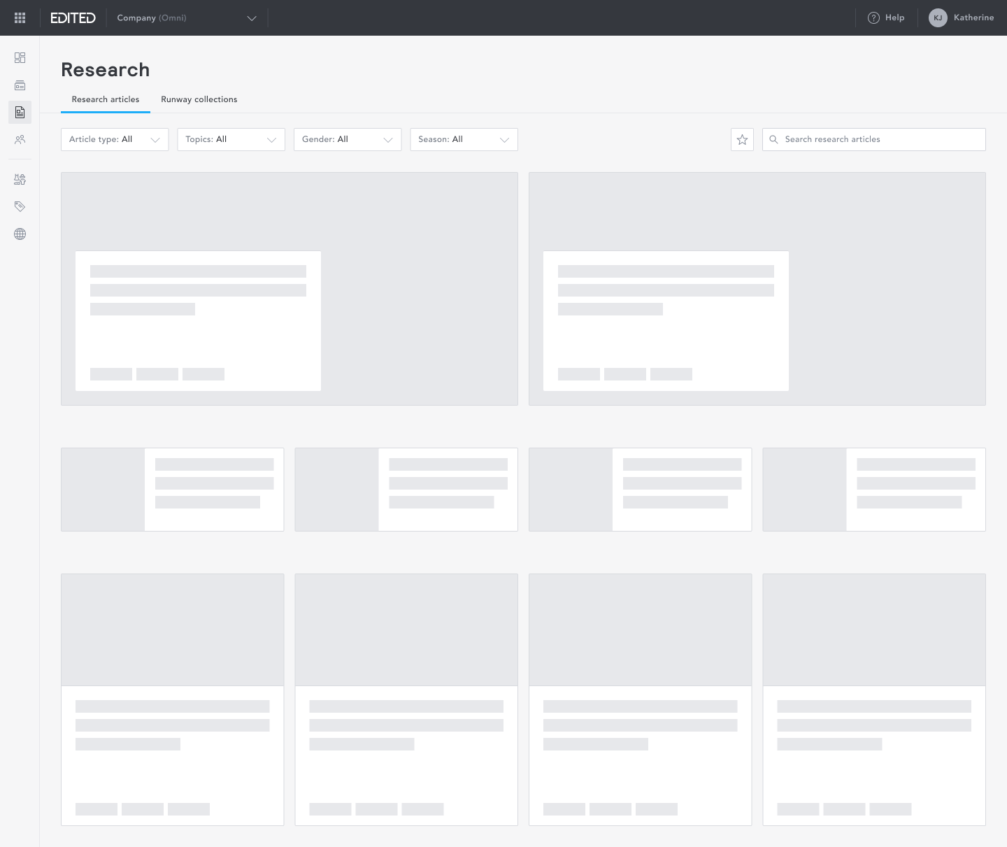
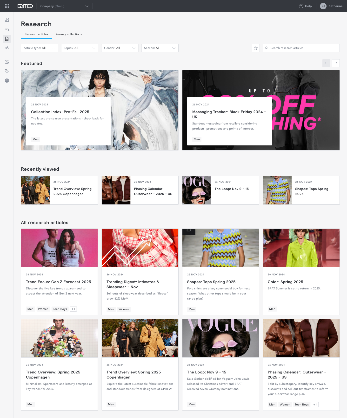
I explored several layout directions before settling on a swim-lane structure, where each lane has its own distinct visual treatment to create hierarchy and rhythm. Research articles are organised into three lanes:
- Featured: surfaces must-read articles, curated by EDITED's analysts for immediate relevance
- Recently viewed: lets users pick up exactly where they left off, without searching
- All research articles: a complete, browsable library of content
This structure gave the page an editorial quality, more akin to a content platform than a data tool, which was a deliberate departure from the rest of the product.
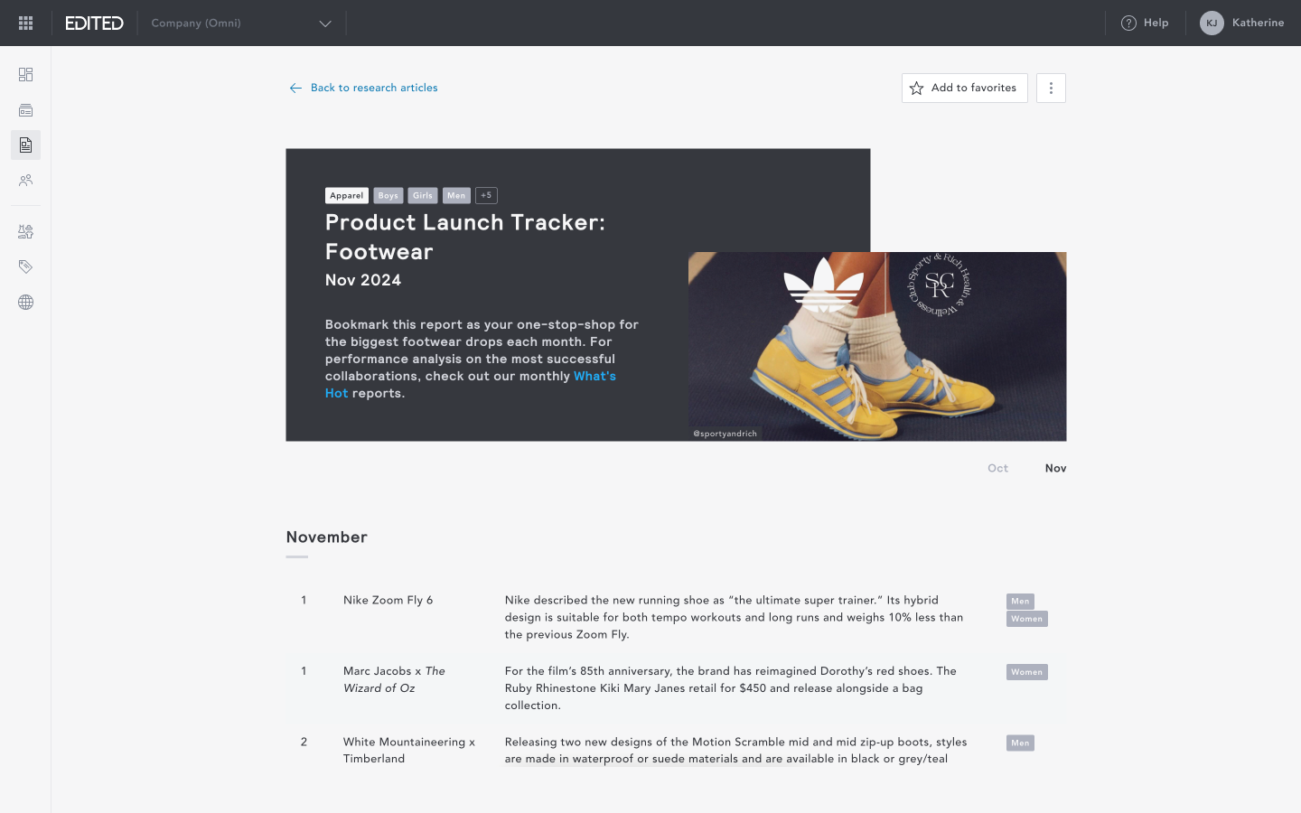
Reading an article
Articles open in a clean, full-page reading view that keeps focus on the content. Users can add articles to their favourites directly from within the reading view.
Runway collection: Layout
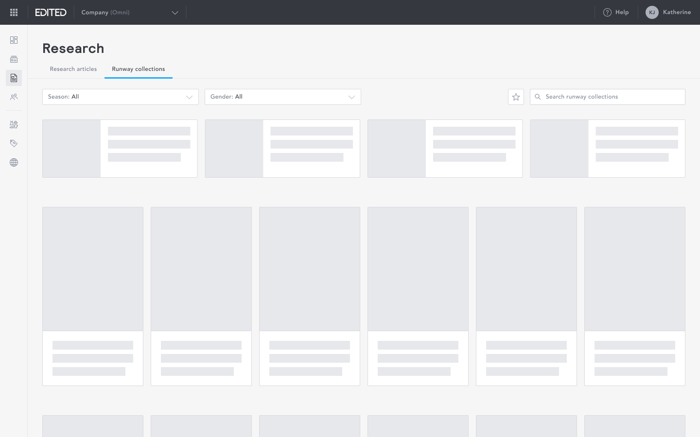
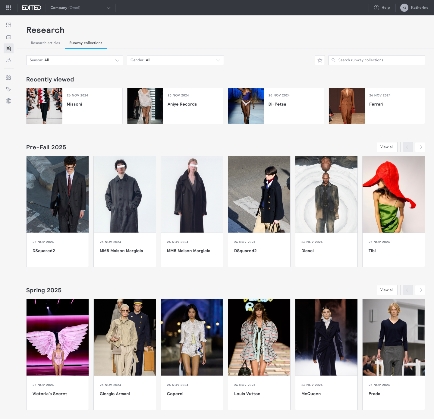
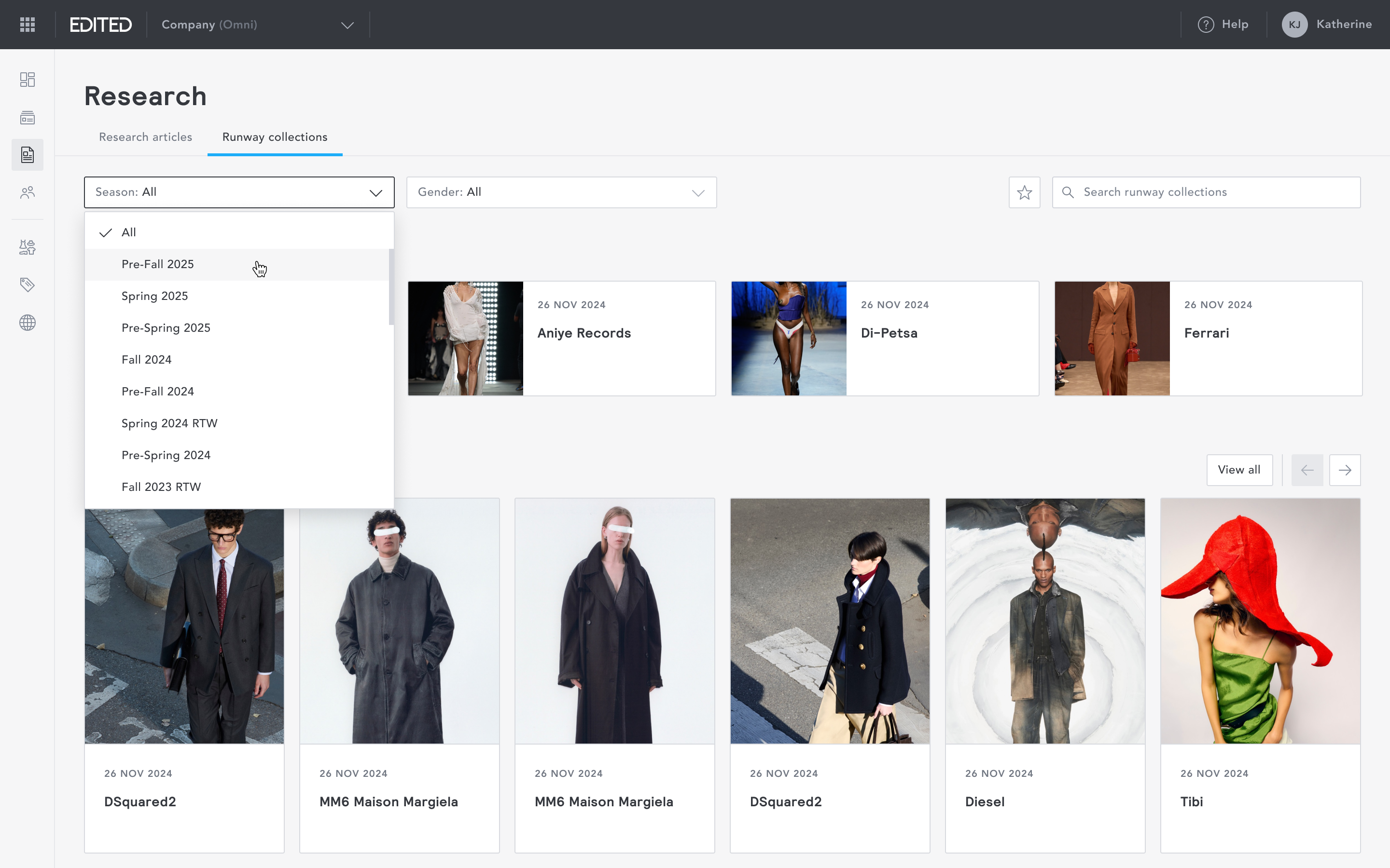
Runway collections followed the same swim-lane approach as research articles, with each lane representing a retail season.
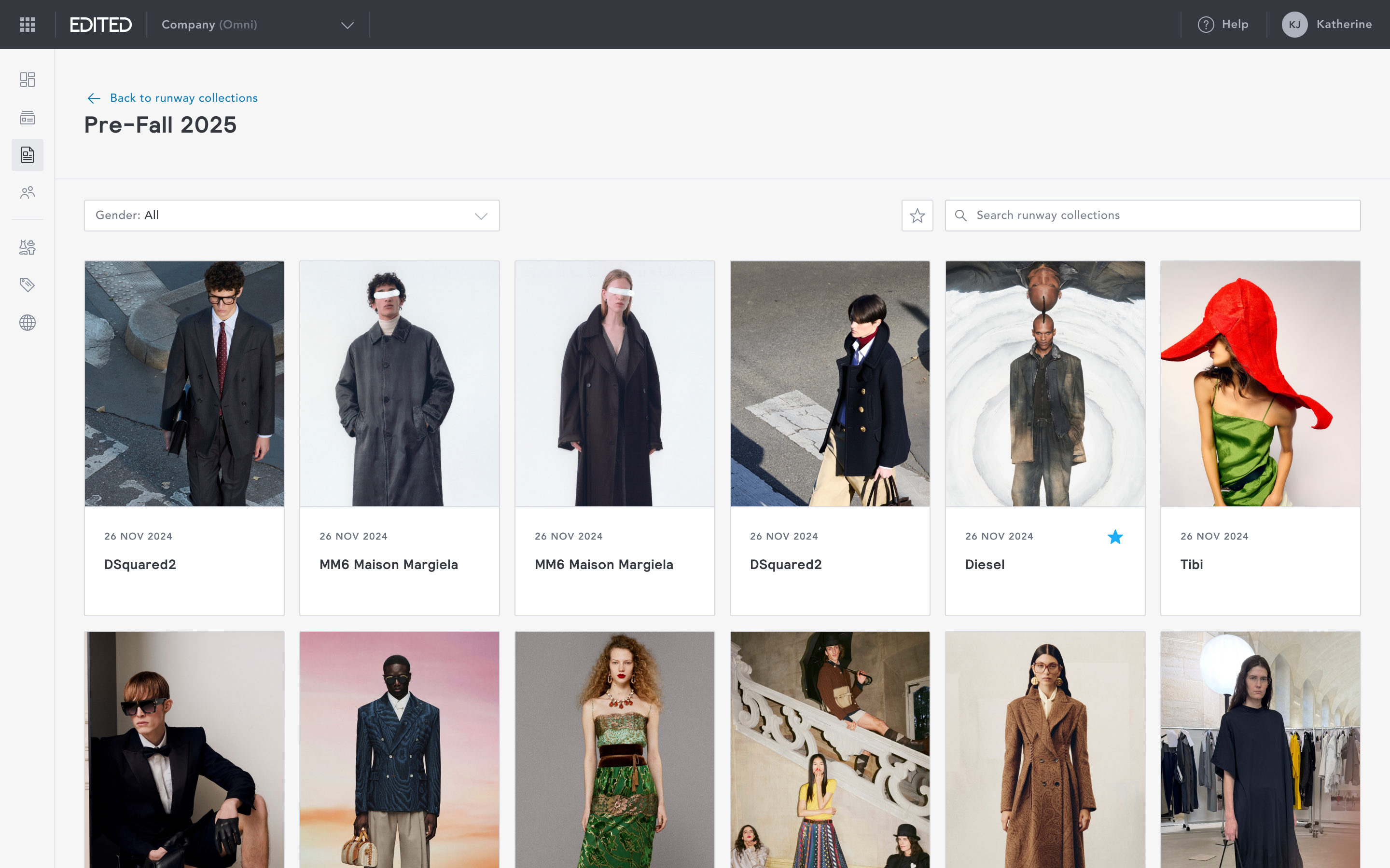
Users can click into a specific season to browse all collections for that period.
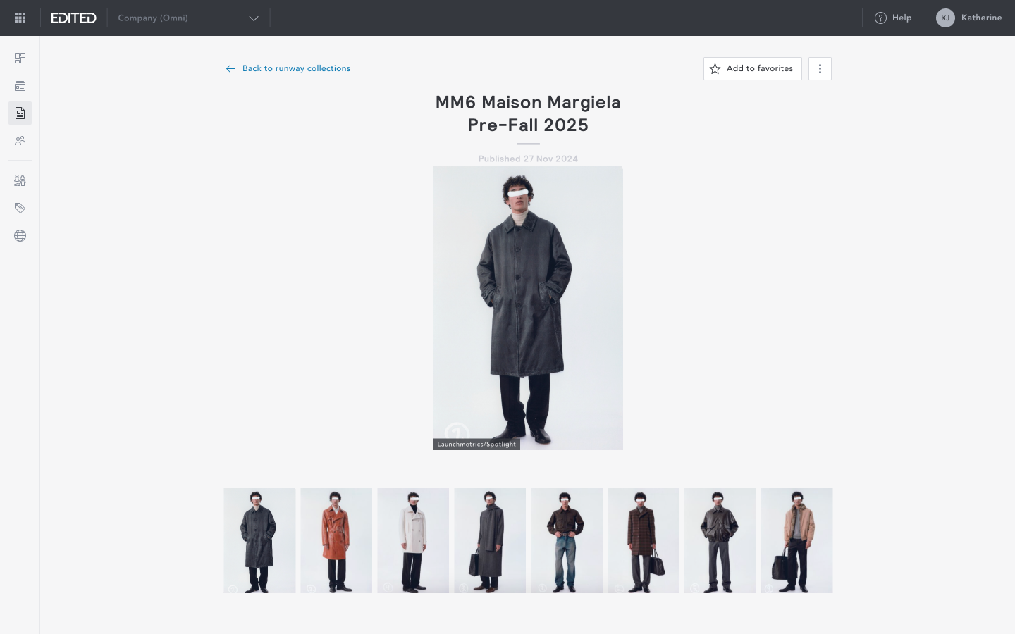
Viewing a collection
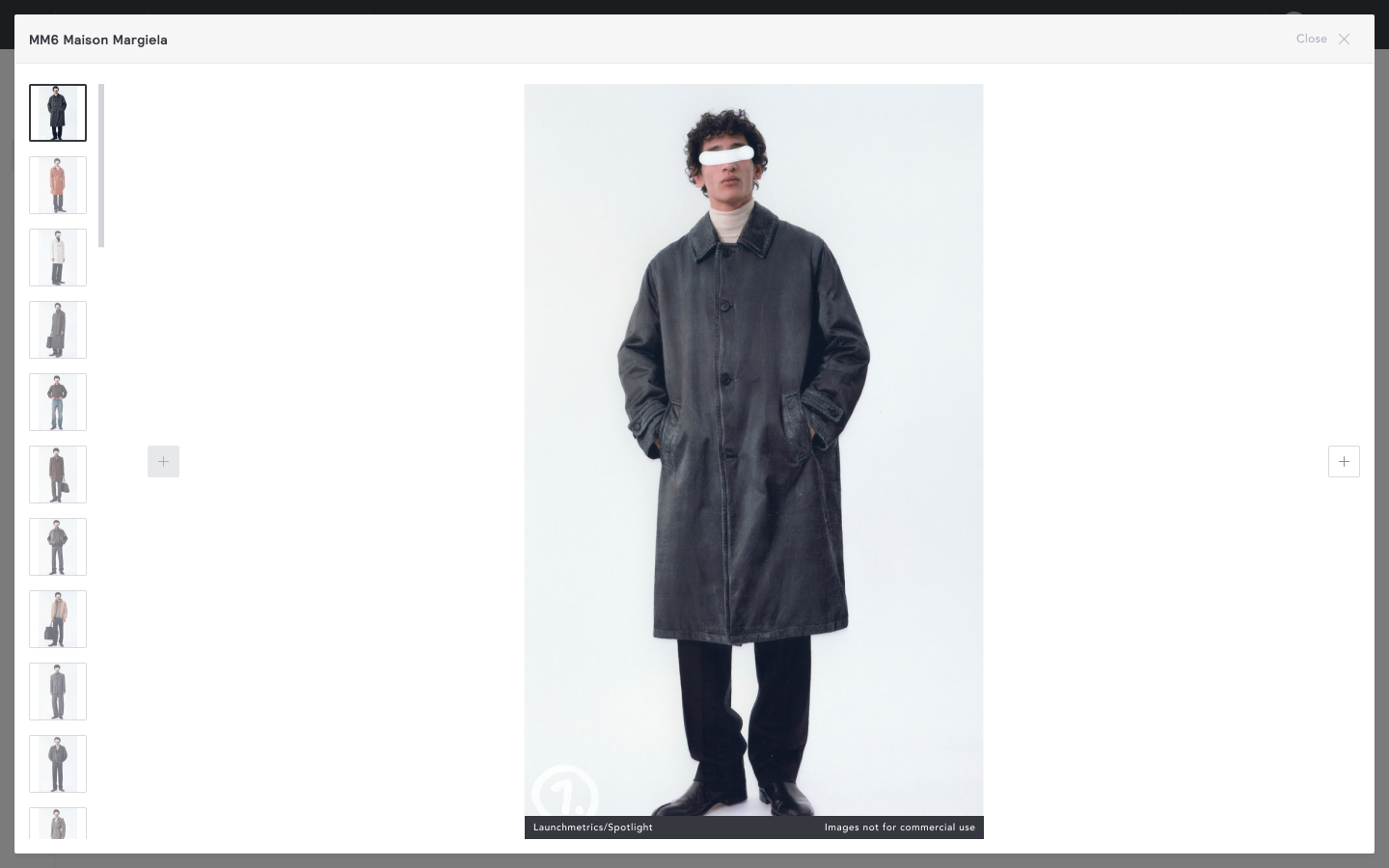
Runway collections display as a gallery of images. Individual runway images open in a lightbox.
Filters
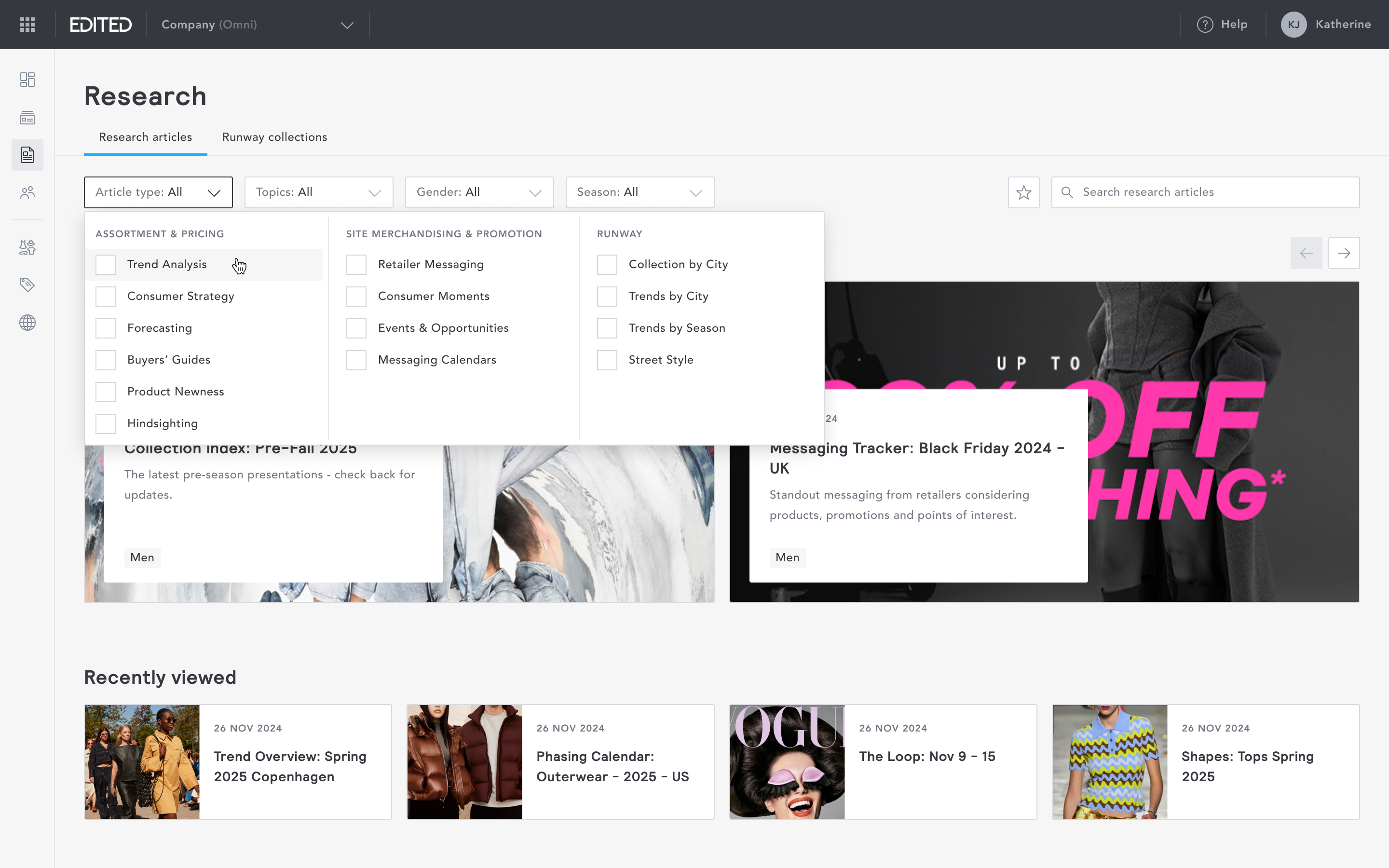
Users can narrow content using a set of curated filters or search directly by keyword. The filter taxonomy was developed in collaboration with EDITED's analysts to reflect how users actually think about and look for content, rather than how it was internally labelled.
Favourites
Users can favourite any research article or runway collection to revisit later. The favourites toggle lives in the filter bar, meaning saved content is always one click away. This addressed a clear gap in the legacy experience, where there was no persistent way to save or return to specific content.
Impact
Following launch, engagement and adoption metrics exceeded expectations within the first two months.
Performance metric
Research articles - Favouriting
Research articles - Page views
Runway collections - Visitors
Runway collections - Page views
Monthly active accounts
Monthly active users
Target
125 feature clicks
20K page views
200 visitors
2K page views
70 accounts
850 users
Outcome
324 feature clicks (+258%)
49.6K page views (+248%)
298 visitors (+149%)
10.6K page views (+532%)
161 accounts (+130%)
1489 users (+75%)
Research
Overview
Research provides data-backed retail analysis, trend insights, and runway coverage created by EDITED’s in-house industry analysts using live data from the platform.
Research was the second most-used feature on the legacy platform. Re-platforming it presented a clear opportunity to accelerate myEDITED adoption while delivering immediate, tangible value to users.
I led the re-platforming of Research to myEDITED. It became a core engagement driver for the platform, contributing to a 119% increase in time spent in app and a 44% increase in platform stickiness.
Goal
To re-platform EDITED Research into myEDITED, using the new design system to deliver a cleaner, more visual, and intuitive experience while maintaining familiarity for existing users.
Success criteria set with the PM at project start:
- Successful migration from the legacy platform to myEDITED.
- At least a 20% increase in myEDITED adoption and usage post-launch.
Approach
I worked directly with EDITED's in-house Retail Analysts to ensure the migration aligned with both editorial and analytical workflows. Together, we identified pain points in the legacy experience, redefined the information architecture to improve navigation and discoverability, and mapped out where meaningful improvements could be made.
Unlike the rest of the platform, which is built around tables, charts and filter configurations, I wanted Research to feel distinctly different; high visuals and immediately engaging.
Navigation
EDITED Research consisted of two main content types:
- research articles: data-backed reports combining market analysis and trend insights, and
- runway collections: a curated gallery of images from global runway shows
In the legacy platform, switching between these content types was hidden behind a dropdown menu, meaning first-time users had to hunt before finding it. I surfaced both content types as two clearly separated tabs from the outset, giving users an immediate understanding of what was available without needing to explore.
Research articles: Layout
I explored several layout directions before settling on a swim-lane structure, where each lane has its own distinct visual treatment to create hierarchy and rhythm. Research articles are organised into three lanes:
- Featured: surfaces must-read articles, curated by EDITED's analysts for immediate relevance
- Recently viewed: lets users pick up exactly where they left off, without searching
- All research articles: a complete, browsable library of content
This structure gave the page an editorial quality, more akin to a content platform than a data tool, which was a deliberate departure from the rest of the product.
Reading an article
Articles open in a clean, full-page reading view that keeps focus on the content. Users can add articles to their favourites directly from within the reading view.
Runway collection: Layout
Runway collections followed the same swim-lane approach as research articles, with each lane representing a retail season.
Users can click into a specific season to browse all collections for that period.
Viewing a collection
Runway collections display as a gallery of images. Individual runway images open in a lightbox.
Filters
Users can narrow content using a set of curated filters or search directly by keyword. The filter taxonomy was developed in collaboration with EDITED's analysts to reflect how users actually think about and look for content, rather than how it was internally labelled.
Favourites
Users can favourite any research article or runway collection to revisit later. The favourites toggle lives in the filter bar, meaning saved content is always one click away. This addressed a clear gap in the legacy experience, where there was no persistent way to save or return to specific content.
Impact
Following launch, engagement and adoption metrics exceeded expectations within the first two months.
Performance metric
Research articles - Favouriting
Research articles - Page views
Runway collections - Visitors
Runway collections - Page views
Monthly active accounts
Monthly active users
Target
125 feature clicks
20K page views
200 visitors
2K page views
70 accounts
850 users
Outcome
324 feature clicks (+258%)
49.6K page views (+248%)
298 visitors (+149%)
10.6K page views (+532%)
161 accounts (+130%)
1489 users (+75%)